盒子模型 — 依赖 display 属性 + position属性 + float属性
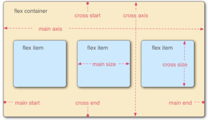
Flex 布局 — flex属性是flex-grow, flex-shrink 和 flex-basis 的简写
Flex 布局以后,子元素的float、clear和vertical-align属性将失效
.div {
-webkit-box-orient:horizontal | vertical;/*-webkit-box-orient控制主轴和侧轴分别是哪一根 Safari 6.1 (及更新浏览器) 通过 -webkit-flex 属性支持*/
flex-direction: row | row-reverse | column | column-reverse; /*主轴的方向*/
flex-wrap: nowrap | wrap | wrap-reverse;/*决定一条轴线排不下,如何换行*/
flex-flow: <flex-direction> || <flex-wrap>;/*flex-direction属性和flex-wrap*/
justify-content: flex-start | flex-end | center | space-between | space-around;/*项目在主轴上的对齐方式 左 右 中 两端&间隔对等 每个两侧间隔相等*/
align-items: flex-start | flex-end | center | baseline | stretch;/*项目对其方式 上下中 第一行文字的基线对齐 拉伸(默认)*/
-webkit-box-pack: start 富裕空间在右边 end 富裕空间在左边
center 富裕空间在两边 justify 富裕空间在项目之间
align-content: flex-start | flex-end | center | space-between | space-around | stretch;
/*align-content属性定义了多根轴线的对齐方式。如果项目只有一根轴线,该属性不起作用。*/
}align-content :: https://developer.mozilla.org/en-US/docs/Web/CSS/align-content
.item {
order: <integer>;/*项目的排列顺序。数值越小,排列越靠前,默认为0。*/
flex-grow: number|initial|inherit;/*弹性盒子的扩展比率*/
flex-shrink: <number>; /* default 1 在所有因子相加之后计算比率来进行空间收缩*/
flex-basis / flex-grow: <width> | sizing keywords | content | auto; /* default auto */
align-self: auto | flex-start | flex-end | center | baseline | stretch;
/*align-self属性允许单个项目有与其他项目不一样的对齐方式,可覆盖align-items属性*/
}注意:
当元素的排列方向为横向:
元素的总宽度小于容器的宽度,使用flex-grow属性;
元素的总宽度大于容器的宽度,使用flex-shrink属性;
当元素排列的方向为纵向:
元素的总高度小于容器的高度,使用flex-grow属性;
元素的总高度小于容器的高度,使用flex-shrink属性;
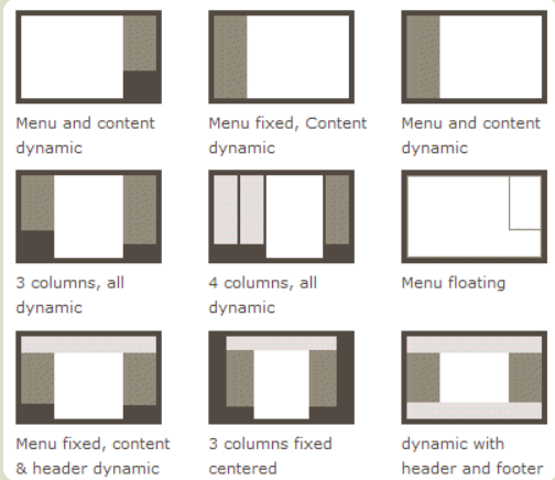
Flexbox demo
DEMO地址:
https://lincenying.github.io/vue2-flex/
仓库地址:
https://github.com/lincenying/vue2-flex
Flexbox 布局demo
仓库地址:
https://github.com/philipwalton/solved-by-flexbox
DEMO地址:
https://philipwalton.github.io/solved-by-flexbox/
该实例列举 6 中常见的布局方式, 包括:
- 网格系统
https://philipwalton.github.io/solved-by-flexbox/demos/grids/ - 圣杯布局
https://philipwalton.github.io/solved-by-flexbox/demos/holy-grail/ - input 拓展
https://philipwalton.github.io/solved-by-flexbox/demos/input-add-ons/ - 图文排版
https://philipwalton.github.io/solved-by-flexbox/demos/media-object/ - 固定底部
https://philipwalton.github.io/solved-by-flexbox/demos/sticky-footer/ - 绝对居中
https://philipwalton.github.io/solved-by-flexbox/demos/vertical-centering/